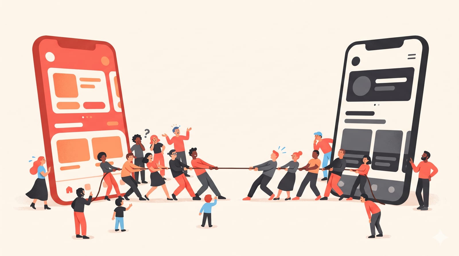
Apple Music's new icon showed up in developer betas in October, and the reaction was swift: boring, generic, "a design school assignment". A couple of months earlier, Plex brought back the side menu it had removed from its TV apps after months of complaints. Every redesign draws some anger. The hard part, for the team that shipped it, is telling ordinary change aversion apart from a design that is actually worse. Here is how to read the backlash, using these two recent cases.
Two redesigns, two different problems
Apple Music: a new face on a familiar app
According to Rolling Out's report on 21 October, the icon's red background was replaced by a simpler black-and-white design, with a white-on-black version for dark mode and a tintable clear version in testing. The "Music" wordmark went all lowercase in a heavier, wider typeface. Some testers also noticed the in-app red accent shifting towards blue.
Commenters called it boring and generic. Much of the frustration, the report notes, came from attachment to the red icon people had seen on their home screens for years. As of that report, the change was still in developer betas, and it remained to be seen whether Apple would adjust it before release.
Plex: a navigation change people use every day
Plex's redesign of its big-screen apps removed the collapsible left-side navigation menu. XDA reported in August 2026 that after months of "passionate feedback" on Reddit, Plex announced on its forums that the panel was coming back, in a preview update for Apple TV, Roku and Android TV. Users in Plex's subreddit seemed happy with the rollback.
Put the two side by side and the difference is obvious. One changed how the app looks. The other changed how people get around. That distinction is most of the diagnosis.
What change aversion actually is
Jakob Nielsen's short Nielsen Norman Group video on why users hate change makes the core point directly: any new interface will draw complaints, and complaints alone don't show that the new design is worse. People resist change because they don't want to relearn how to do things they already know how to do. The aversion can be reduced, he says, but not eliminated.
Google researchers Aaron Sedley and Hendrik Müller described the same thing in a CHI 2013 case study on moving Google Docs List to Google Drive: users of tools they rely on can feel anxious or confused when an interface changes suddenly, even when the designers mean well. Their argument was that some resistance is unavoidable, but it can be managed.
How to tell aversion from a real problem
Here is the test I'd apply to any backlash, with these two cases as examples.
Signs it is mostly change aversion
Complaints are about taste, words like "boring", "ugly", "generic", with no task attached.
Nothing takes longer to do. You can still open the app, find your playlist and press play in the same number of steps.
The anger fades as people get used to it, and usage doesn't drop.
Apple Music's icon fits this pattern, at least so far. An icon is recognition, not navigation. People will find the new one within a week, even if some never come to love it.
Signs the design is actually worse
Complaints name a task: "I can't find", "it takes three clicks now", "I keep ending up in the wrong place".
Workarounds appear. When people install extensions, write filters or dig into settings to restore the old layout, they are telling you the new one costs them effort. We saw exactly that with YouTube's comments sidebar test.
The complaints don't fade. Plex's lasted months, which is a strong signal that people weren't just adjusting.
On a TV, a side menu is how you move around with a remote. Removing it changed the physical effort of every session. That is not taste; it is task cost.
How to ship a redesign with less backlash
Nielsen and Sedley agree you can't avoid all of it. You can avoid the self-inflicted part:
Separate visual changes from navigation changes. Ship a new look and a new structure in different releases. When both change at once, you can't tell which one people hate, and neither can they.
Tell people before it happens, and say why in one sentence that names a benefit to them, not to your brand.
Offer a way back for a while. A temporary "switch to classic" option turns a forced change into a choice, which takes the edge off.
Measure tasks, not just sentiment. Time to find, steps to complete, error rates. If those hold steady while complaints spike, wait it out. If they get worse, the complaints are right.
Decide your rollback criteria in advance. Plex's reversal took months. Agreeing beforehand on what would trigger a rollback makes that call faster and less emotional.
A note for anyone redesigning around a new visual system
Platform-wide style shifts make this harder, because every app changes at once and users feel the churn everywhere. If you are adapting an app to Apple's newer look, our iOS 27 and Liquid Glass checklist is a good place to separate what you must change from what you merely can.
The rule of thumb: when people complain about how something looks, give it time. When they complain about how hard something has become, listen right away.