
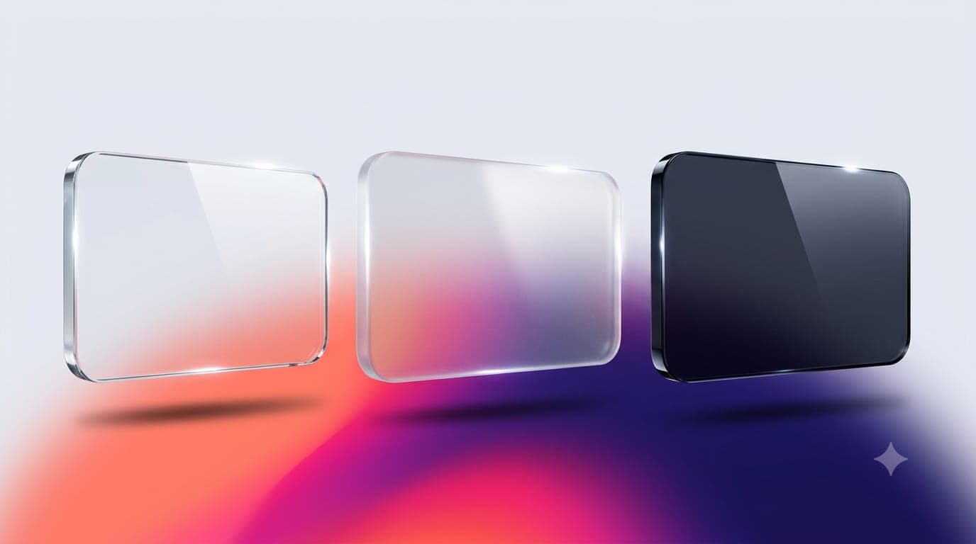
Liquid Glass was the most argued-over piece of interface design of the past year, and mostly for one reason: text on translucent surfaces is hard to read. iOS 27 is out, and Apple has changed the foundations of the effect. If you design apps for iPhone, that is good news, but it does not mean you can stop looking at your own screens.
Here is what changed, what Apple handles for you, and what a designer still needs to check by hand.
What is different in iOS 27
Going by MacRumors' summary of Apple's WWDC announcements, the changes are:
Better diffusion. Liquid Glass now diffuses complex content behind it more effectively, which is aimed squarely at the readability complaints.
Clearer edges. A darkened edge around glass elements, plus brighter specular highlights, gives more separation between a control and whatever sits underneath it.
A user-controlled slider. A new setting lets people adjust the effect anywhere from ultra clear to fully tinted. This is the change with the biggest design consequence, and I come back to it below.
Steadier toolbars. When content scrolls under a floating bar, a uniform toolbar now appears across the top so text stays legible.
Sharper icons. Icons render with more definition, with optional refraction effects for character.
Sidebar colour. Coloured sidebar icons return, but only for the active app, a small move that reduces visual noise.
Cult of Mac's roundup adds that macOS 27 fixes the inconsistent corner radius from macOS 26, again without any work from developers.
What you get for free
According to MacRumors, apps that already use Liquid Glass receive these improvements when running on iOS 27 without being recompiled, and the system adapts to accessibility settings such as Reduce Transparency and Increase Contrast. Standard toolbars pick up the new scrolling behaviour automatically.
The catch is the word "standard". Custom components, hand-built overlays and anything you drew yourself do not benefit from a system fix. They are your responsibility.
Is Liquid Glass still optional?
Not for long, if earlier reporting holds. AppleInsider reported in March that the option to defer adoption would be disabled once Xcode 27 arrived, meaning apps would be expected to use the new design. That was a report ahead of the release, so check Apple's current developer documentation for the exact rule that applies to your app and timeline. Separately, Apple has said that from April 2027, apps uploaded to App Store Connect must be built with the iOS 27 SDK or later, according to 9to5Mac.
A designer's checklist for this month
Review at both ends of the slider. Design and check key screens with the effect at ultra clear and at fully tinted. If a label only reads well at one setting, the design is too dependent on the effect.
Turn the accessibility settings on. Check Reduce Transparency and Increase Contrast, since these are what many people with low vision actually use. Look for controls that disappear or lose their boundaries.
Test over your worst background. Put your text and icons over the busiest image, the brightest photo and the darkest one in your product. The system diffuses content better than before, but it cannot fix a thin grey label on a patterned photo.
Audit every custom surface. List the components that are not standard bars, sheets or controls, and check each one on its own. Those are where the old readability problems will survive.
Rebuild your icon with layers in mind. Apple's Icon Composer was updated for multi-layer Liquid Glass construction, and the new refraction is optional. Use it sparingly, and check the icon at small sizes against light and dark wallpapers.
Refresh your store assets. Apple has also reminded developers to update App Store listings with new product page headers and search result assets that follow its updated guidance.
A design principle worth keeping
An effect that the user can turn down is a decoration, not a foundation. Build hierarchy from contrast, spacing and type size first, then let the glass sit on top. If your interface holds together with the slider at its plainest setting, it will hold up on every device and for every person, whichever way Apple's design language moves next.