Open almost any design system file and you will find a beautiful default button. Click into the variants and the story gets thinner: a hover state, maybe a disabled one, and no focus state at all. Developers then invent the missing states in code, each one slightly differently. Figma's 15 October launch made this gap harder to ignore. Among the design system tools it announced is a "system check" that scans libraries for gaps, with missing descriptions and missing interactive states named first. Here is a practical checklist of the states a component actually needs, what accessibility rules apply to each, and how to fix the gaps before a tool, or a confused developer, finds them.
What Figma announced
In the "Build by design" post, Figma described a set of design system controls: code sources that let agents build components matching your coded system, guidelines attached to published libraries, a system map in preview for managing libraries together, and system check, which looks for gaps such as missing descriptions and interactive states.
The reasoning is easy to follow. If agents are going to generate screens from your library, they will copy whatever is there. A button with no focus state produces a hundred screens with no focus state. Gaps that used to cost one developer an afternoon now multiply.
You do not need to wait for any tool to start. The checklist below works with any library.
The states most components need
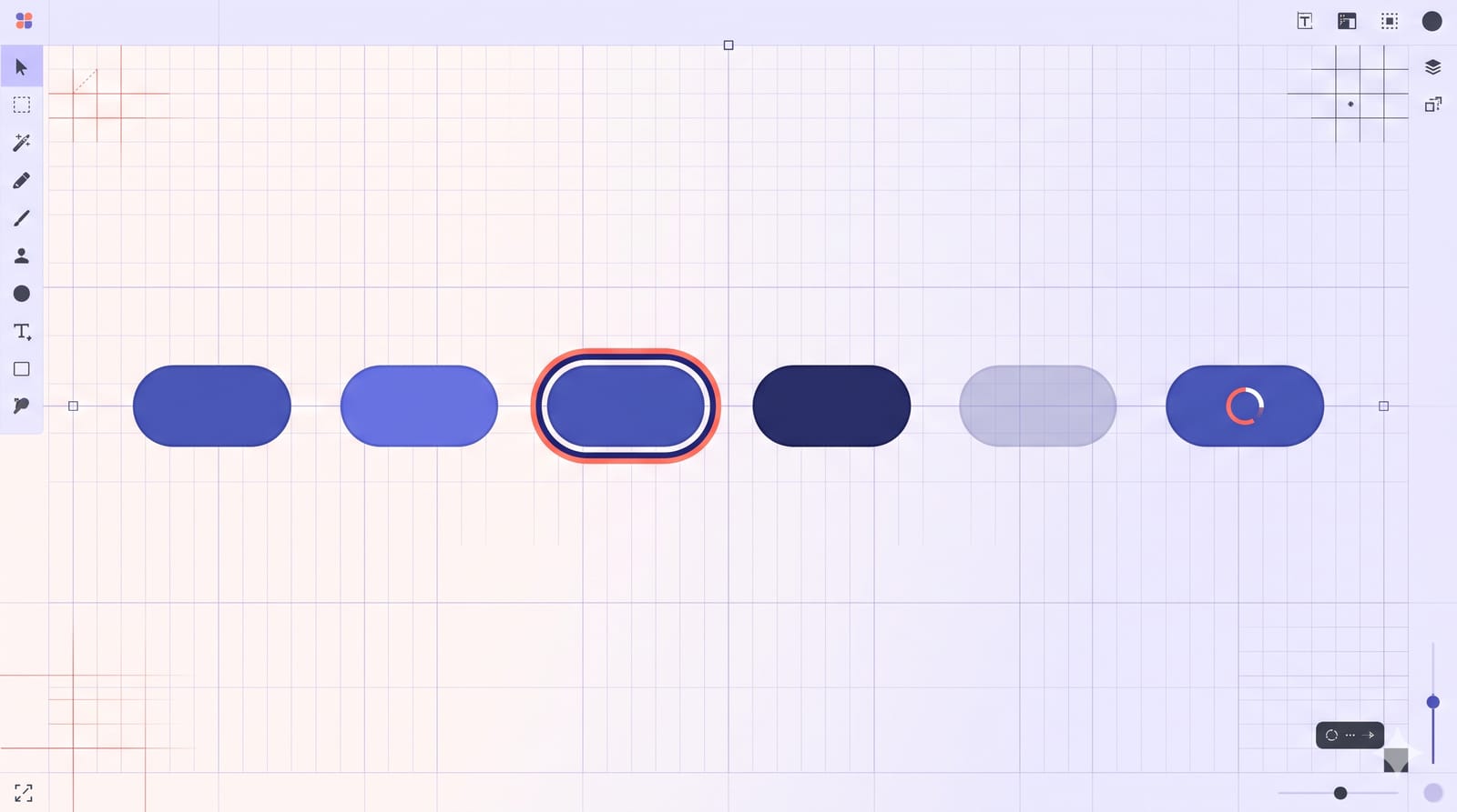
Picture a primary button sitting in a row of variants on your canvas. Reading left to right, this is the set I would expect for anything interactive:
Default (enabled). The resting state. Everyone draws this one.
Hover. Pointer is over it. A subtle tint or shadow change is enough.
Focus. Reached by keyboard. Usually a visible ring around the component.
Pressed (active). The moment of the click or tap. Often a slightly darker fill.
Disabled. Visible but not available. Muted, and not clickable.
Loading or busy, for actions that take time. The label is replaced or joined by a spinner, and the button cannot be pressed twice.
Inputs add a few of their own: filled, error and read-only. Selectable items such as tabs, chips and checkboxes add selected, and often selected plus hover and selected plus focus. That is where variant counts start to climb, and where most files quietly give up.
The two accessibility rules that apply
Two WCAG 2.2 success criteria do most of the work here, and both are Level AA, the level most regulations and procurement rules point to.
Focus must be visible
Success criterion 2.4.7, Focus Visible, says: "Any keyboard operable user interface has a mode of operation where the keyboard focus indicator is visible." The W3C's guidance lists common failures, including styling outlines so the indicator disappears. If your library has no focus variant, the likely outcome is that someone writes outline: none to remove the browser default, and keyboard users lose their place on the page.
Design the focus state as its own variant, not an afterthought. A two-colour ring (for example a dark outer line with a light inner gap) holds up on both light and dark backgrounds, which the W3C also mentions as a sufficient technique.
State indicators need 3:1 contrast
Success criterion 1.4.11, Non-text Contrast, requires a contrast ratio of at least 3:1 against adjacent colours for the visual information needed to identify components and their states. That covers your focus ring and your selected state. The W3C notes the 3:1 threshold is strict: 2.999:1 fails.
Two details save a lot of argument in design reviews:
Hover is treated differently. The pointer already shows where you are, so an added hover tint is supplemental and does not need to reach 3:1. It must not reduce the contrast of the component itself.
Disabled components are exempt from contrast requirements. That does not mean they should be invisible. A disabled button nobody can find is just as confusing as one nobody can read.
If you are working through accessibility obligations more broadly, our checklist for SEBI's accessibility deadline and the notes on what the WCAG 3.0 draft means for designers give the wider context.
Write the description, too
Figma's check also looks for missing descriptions, and they matter more than they seem. A description is where you say when to use the component and when not to: "Primary button. One per view, for the main action. Use Secondary for everything else." Without it, a developer or an agent picks the component that looks closest, and your carefully separated primary and secondary actions collapse into a screen full of blue.
A good description is short and covers three things:
What it is for, in one sentence.
When not to use it, and what to use instead.
Any behaviour the visuals cannot show, such as "label truncates after 24 characters" or "loading state blocks repeat clicks".
A one-hour audit you can run this week
Pick your five most-used components. For a typical product that is button, text input, select, checkbox and tab. For each one, check:
Does it have hover, focus, pressed and disabled variants? Inputs: error and filled too.
Is the focus ring clearly visible on every background the component appears on?
Do the focus and selected indicators reach 3:1 against what sits next to them? Use any contrast checker plugin.
Is there a loading state for anything that triggers a network request?
Does it have a description that says when not to use it?
Write the gaps in a single table: component, missing state, owner. Most teams find focus states missing on half their components and descriptions missing on nearly all of them. Both are quick to add.
If you plan to lean on Figma's agent to generate variants, keep an eye on what it costs; we covered where AI credits are worth spending. Filling in states is a decent use, as long as a person checks the focus ring and the contrast before publishing.
The takeaway
A component is not finished when its default state looks good. It is finished when every state a user can reach is designed, visible and described. Tools that scan for gaps are arriving, and agents will copy whatever your library contains. Spend the hour now, and the next hundred screens built from your system will inherit focus rings instead of missing them. Details on Figma's features are as announced on 15 October 2026; availability may differ by plan.