Apple's first folding iPhone, the iPhone Duo, was scheduled to go on sale in India on 23 October, according to Esquire India. For designers, the interesting part is not the hinge. It is what Apple's new Human Interface Guidelines page asks your layouts to do: toolbars and tab bars move to the side of the screen, a fold appears in the middle of your content, and the same app has to feel continuous across two very different displays. Here is what the guidance says, and what to check in your own designs first.
The anatomy, in layout terms
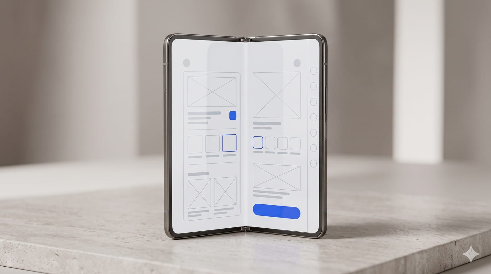
Apple published Designing for iPhone Duo on 9 September. The device has an inner and an outer display, each with its own front camera, joined by a centre hinge.
Picture the outer display first. It is wider and shorter than other iPhones. Instead of a tab bar along the bottom and a toolbar along the top, the system places them in a vertical strip down one side, so content gets the full height. When you open the device and hold it in landscape, those controls stay on the side, so the move between displays feels consistent. Only the inner display in portrait has enough height to keep the usual horizontal bars.
The outer camera sits in a corner, always visible, aligned with the side controls. The inner camera hides behind the display until it is in use.
Apple is clear that this is still an iPhone: iOS patterns and best practices still apply. If you use standard components and support resizing, Apple says your app adapts to the device's poses with little adjustment.
Design for sizes, not for poses
People can hold the Duo partly folded like a book, lay it on a table or stand it on an edge. That sounds like a lot of layouts. Apple's guidance says the opposite: use size classes so the app adapts as it changes size. A compact-width layout for the outer display and a regular-width layout for the inner one give you the fundamentals for every pose.
Its most useful line is a warning: "Don't reinvent your app when it resizes". Let the existing layout expand into the space.
Mail is Apple's example. Closed, it shows either the list of emails or one email. Open, it shows both side by side. Same hierarchy, one extra level visible when there is room. That is the pattern to copy.
Designing around the fold
The new concept here is reserved regions: parts of the display that content should avoid. There are three:
The outer front camera, always present, which expands into the Dynamic Island for Live Activities.
The inner front camera, present only when it is active. The UI moves aside to show it is on.
The folding region, present only when the device is partly open. It divides the inner display and excludes the centre strip.
System alerts, menus and sheets move away from the fold on their own, and split views adjust their column widths to match the inner display's symmetry. Custom components are your job, and Apple provides a ReservedRegion API for SwiftUI and UIKit to move content clear of these areas.
Two pieces of advice stand out. In a grid, prefer an even number of columns, so content divides cleanly at the fold. And avoid extreme layout changes as people fold the device: move only what you must to keep things visible and tappable. A control that jumps across the screen is a control people lose.
Vertical controls: the part designers will get wrong
This is the genuinely new habit. Before, the order of a toolbar was left to right. Now it is also top to bottom. Apple's guidance, condensed:
Reserve the top of the vertical strip for primary navigation, such as Back or Close, followed by prominent actions like Done.
Items overflow from bottom to top by default. Set visibility priorities so the actions people use most, like Compose in Mail, stay visible longest.
Give every toolbar item both a title and a symbol. The system picks the right one for the space, and uses the title in overflow menus.
Keep text-only buttons to a minimum. Labels with text stay in a horizontal bar, so prefer symbols where one works.
Use the system overflow menu rather than your own, and keep the ellipsis symbol only for overflow.
Keep controls near the content they affect. In Mail, list controls stay above the list pane rather than joining the side strip.
One subtle detail: because the strip is aligned with the hardware, it stays on the same side in right-to-left languages. And when two apps share the inner display, each puts its controls on its outer edge.
The result is asymmetric content space: a strip on one edge, content beside it. Use safe areas so nothing hides under the controls, including the other app's controls in split view.
What to check in your designs first
Fixed widths. Anything sized to a specific iPhone width will break first.
Custom tab bars and toolbars. If you built your own, they will not move to the side automatically. Consider returning to system components.
Text-only toolbar buttons like "Edit" or "Share". Add symbols.
Your own overflow menu. Fold its actions into the system one.
Grids with three or five columns. Test them across the fold.
Anything centred that matters, such as a play button, a scan frame or a call-to-action. When the device is half-open, the centre is the fold.
Why this is worth doing even if few users buy one
Most of this guidance is simply good layout discipline: no fixed widths, system components, clear priorities for actions, content that expands instead of rearranging. A design that survives the Duo will survive split view on iPad and the next screen size Apple ships. The fold is new. Building for sizes rather than devices is not, and the Duo just makes skipping it more visible.