On 7 October 2026, some YouTube desktop users opened a video and found the page rearranged. The player had shrunk, comments sat permanently on the right, and large recommendation thumbnails filled the space under the video. The reaction was swift and mostly furious. Strip away the anger, though, and the test is a clean case study in layout, hierarchy and what happens when a familiar screen changes. Here is the breakdown.
What moved, and where
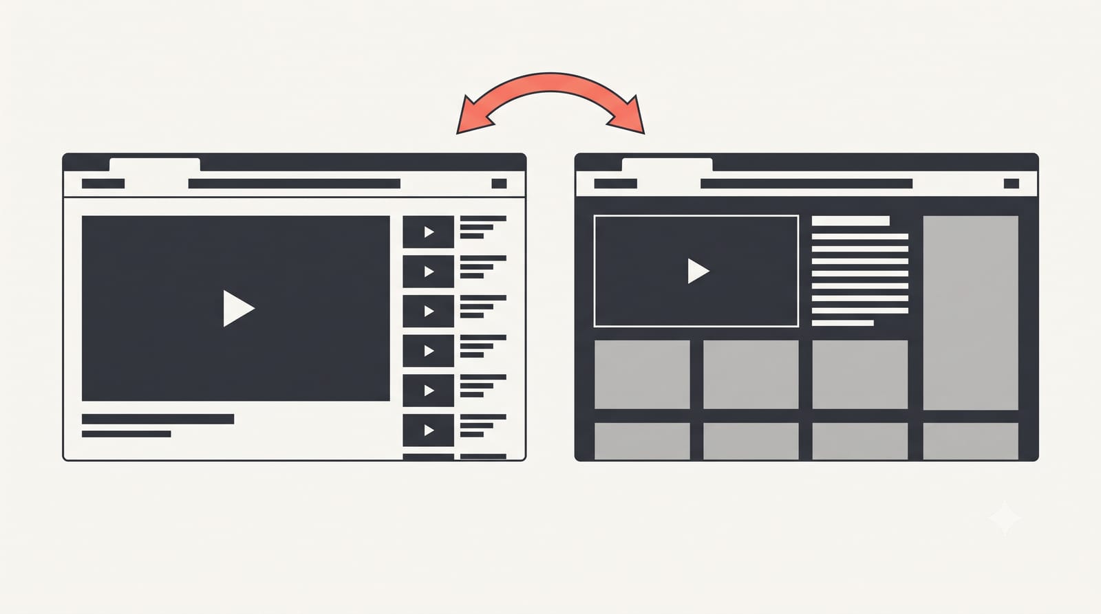
Picture the classic YouTube watch page. The video sits large at the top left. Below it: the title, the channel row, the description, then comments as you scroll. On the right, a narrow column of recommended videos.
The test flips the two lower zones. According to Gagadget's report, the player shrinks to roughly the left half of the window. The right sidebar now holds the title, view count, description and comments. Recommended videos move under the player as big thumbnails. Ubergizmo notes that YouTube has not said whether this is a limited A/B test or the start of a permanent change.
It is also not new. In April 2024 YouTube tested a very similar layout. 9to5Google reported at the time that YouTube called it "only a test for now" and pointed users to the feedback tool. That version was rolled back after similar complaints.
The two complaints that are about design, not habit
A lot of redesign anger is change aversion, and we will get to that. But Gagadget picked out two complaints that hold up even if you ignore habit:
Accidental clicks. Large thumbnails directly under the player sit exactly where your cursor travels when you reach for the progress bar or the volume. A target that big, that close to a frequent action, will get hit by mistake.
Spoilers. When comments are always on screen, you read them whether you want to or not. On a match highlight or a film review, the top comment can give away the ending before you press play.
Both are predictable from the layout itself. You could find them in a design review without a single user test, which makes them more serious than "I liked the old one".
Reading the hierarchy
Every screen makes a claim about what matters most. Size and position are how it makes that claim.
On the old page, the video was the biggest object by far, and everything else waited below the fold or in a narrow side column. The message was: watch.
On the test page, the video gets smaller, and three other things compete at once: a tall text column of comments, a block of metadata, and a grid of large, colourful thumbnails. The thumbnails are the loudest element after the player, because images beat text for attention. The message is now: watch, but also look at what is next.
That is a defensible business choice. Recommendations drive viewing time, and putting them under the player is how the mobile app already works, so the desktop layout gets closer to what most people use daily. But it is a trade. The page now serves discovery at the expense of the task most people came for.
Change aversion is real, and it is not the whole story
Jakob Nielsen has a short Nielsen Norman Group video, "Users Hate Change", that every designer shipping a redesign should watch. His point: complaints after a launch do not prove the new design is worse. "It simply means that it's new, and users don't like to learn."
That is true, and it is often used as a shield. The trick is to separate two kinds of feedback:
Learning cost: "I can't find the description." This fades within days as people adjust.
Structural cost: "I keep clicking a thumbnail by accident." This does not fade, because the layout keeps causing it.
If YouTube's test data shows watch time going up, it could still be paying for that with structural costs that users carry every session. The two complaints above are structural.
How I would sketch an alternative
Without inventing data about what YouTube measured, a few layout moves would address the structural problems while keeping the mobile-style flow:
Add breathing room under the player. A clear gap, or the title row placed between the player and the thumbnails, reduces mis-clicks without hiding recommendations.
Collapse comments by default. Show a count and the first line, with one click to expand. People who want comments get them; spoilers stay hidden for everyone else.
Let the player grow back. A remembered toggle between "watch" and "browse" layouts respects the fact that viewing a 40-minute documentary and scanning short clips are different tasks.
Users are already building their own fixes. Gagadget notes that extensions and custom uBlock Origin filters can restore the old layout, though they break when YouTube changes its code. When people install software to undo your design, that is a signal worth weighing alongside any engagement chart.
What to take into your own redesigns
Name the primary task of each screen before you move anything. Then check that the largest element still serves it.
Look for big targets placed beside frequent actions. They will be hit by mistake.
Sort feedback into learning cost and structural cost. Wait out the first; fix the second.
If you are testing a big change, give people a way back. It costs you some data and buys a lot of trust.
YouTube may ship this layout, tweak it, or pull it again as it did in 2024. Either way, the test is a useful reminder that hierarchy is a promise about what a page is for. Change the promise, and people notice before they can say why.