The Mac has a touchscreen now, and Apple's advice to designers is surprisingly restrained: don't redesign your app for it. The new MacBook Pro with a PROLED XDR display went on sale on 6 November 2026, and on 28 October Apple added touch guidance to its Human Interface Guidelines. The short version is to keep your layout and control sizes exactly as they are, make tap targets bigger than the controls you can see, and give every hover-only control another way to appear. Here's what that looks like in practice, with examples you can check your own screens against.
What Apple actually shipped
Per Apple's announcement, touch is built into macOS 27 on the new 14-inch and 16-inch MacBook Pro, with the touch sensor integrated into the display panel. People can swipe to scroll, pinch to zoom, drag slides between presentations, double-tap a window to fill the screen and flick a window to tile it. Two details matter for designers:
macOS translates touches into clicks, so most existing apps work with touch on day one, for better or worse.
Touch works alongside the keyboard and trackpad. Nobody is being asked to give those up.
That second point drives everything in the guidelines.
The core rule: touch is a guest, not the host
Apple's Gestures guidance is direct: "Keep the layout and size of interface elements the same when you support touch. In macOS, touch is secondary to keyboard and pointing device input." The reason is that people switch inputs constantly, so the interface has to stay stable whichever one they reach for.
The Designing for macOS page adds the ergonomic reason: people reach forward to touch a laptop screen, so they "tend to use touch for brief, intentional interactions rather than sustained work."
Picture a photo editor's inspector panel: a column of compact sliders and 16-point icon buttons, tightly packed. The tempting move is to inflate everything to iPad proportions. Apple is telling you not to. That panel is optimised for a pointer, and the pointer is still the main way people will use it. If you've been through the iPhone Duo layout changes, this is the opposite instinct: there the layout adapts to the device; here it stays put.
Bigger tap targets, not bigger controls
So how does a finger hit a 16-point button? Apple's answer is in two parts.
Enlarge the invisible hit area
"Make tap targets bigger, not the controls themselves," the guidelines say, anticipating that a touch "may start slightly outside of their visual bounds." Visually nothing changes; the area that responds to a finger is larger than the icon. Standard framework controls get an appropriate tap target from the system automatically, which is one more argument for not rolling your own.
Expand on touch, then shrink back
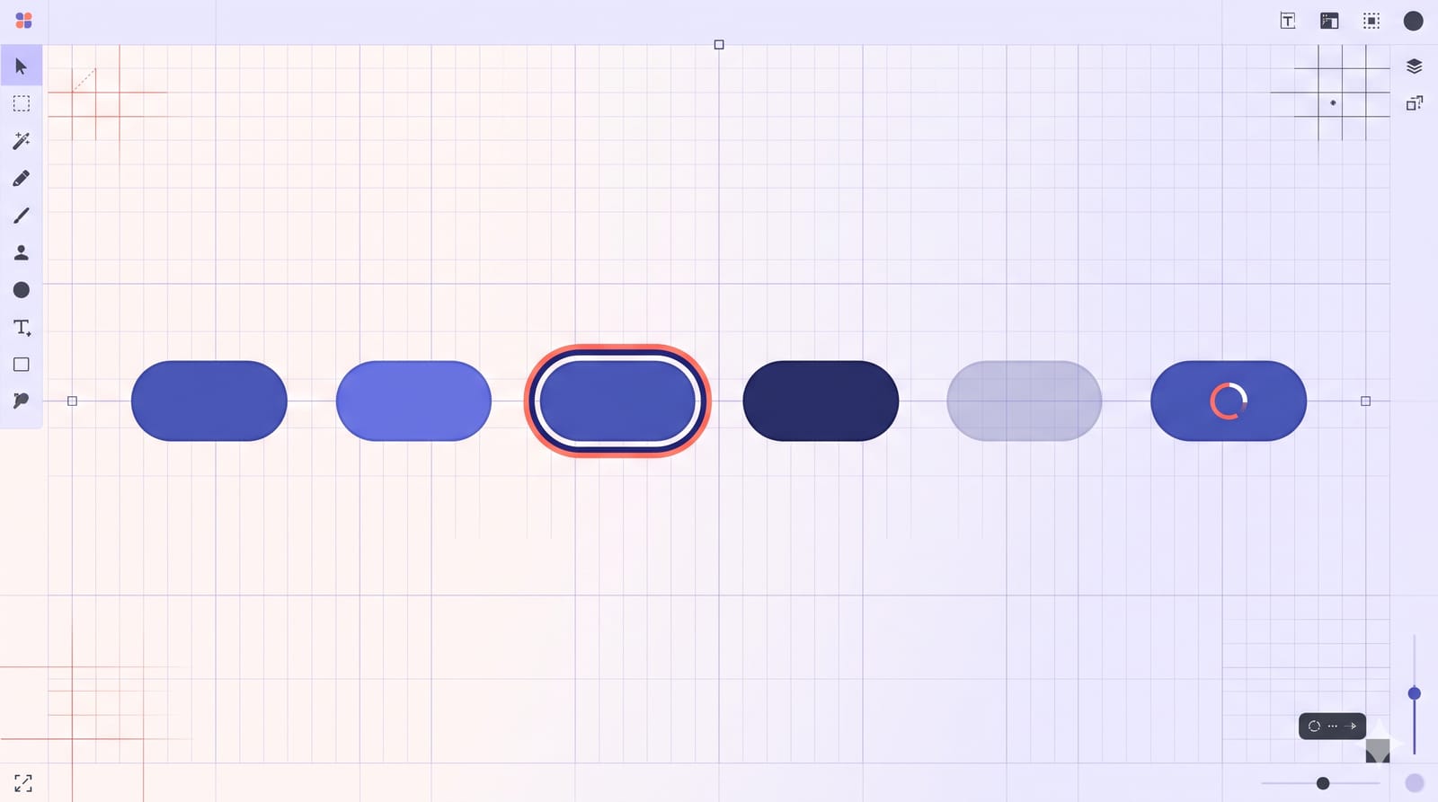
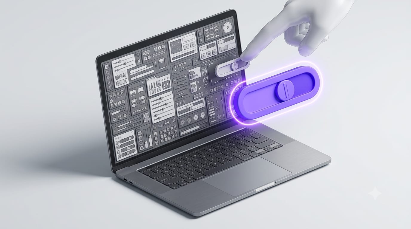
For small or densely packed controls, Apple suggests a temporary, touch-sized variant that appears when someone taps. Imagine that thin slider track in the inspector: tap it and a thicker version blooms under the finger, easy to drag, then stays in place briefly after the finger lifts before collapsing back. Apple notes that standard steppers, sliders and dials "gain this behavior automatically." Custom controls need you to design that expanded state, which belongs alongside the interactive states every component needs in your design system.
Hover-only controls are the real problem
Most Mac apps have controls that only appear when the pointer moves over something: the share and delete icons on a file row, the close button on a tab, the add button next to a sidebar section. A finger has no hover. The Pointing devices guidance now has a section just for this:
Pick what deserves it. Reserve touch support for essential controls. Tooltips don't need it. Carousel arrows don't either, because people can swipe the carousel.
Reveal on tap, hide on its own. Show a hidden control when someone taps its general location, and hide it again when they're done or after a few seconds.
Don't lose the selection. If someone has three files selected and taps to reveal a "Move" button, the three files must still be selected when the button appears. Otherwise they reselect, and they'll be annoyed.
Back it up with a context menu. A touch and hold opens the context menu, giving people a dependable route that doesn't require finding the magic spot.
Don't just leave everything visible. Apple explicitly says to avoid keeping hidden controls showing all the time to accommodate touch.
There are specific rules for sidebars (tap the section header to reveal its controls, without activating them) and tabbed windows (tapping anywhere reveals the selected tab's close button).
Parity in both directions
Two more lines worth pinning to the wall. First: "Don't use touch as the only way to access controls or features." Everything must still work from a keyboard and pointer. Second, the reverse: aim to provide touch equivalents for things that currently need a pointer, like a shift-drag or a menu that opens on hover. Apple also asks that a modifier-key action behaves the same whether you drag with a finger or a pointer: if Option-drag duplicates an object, it should duplicate it either way. And custom gestures should work on both the touchscreen and the trackpad.
What this means if you design for the web
These are native app guidelines, but the hover problem is identical on a website opened in a browser on a touch Mac. Mega-menus that open on hover, row actions that appear on mouseover and tooltips that carry essential information all fail the same way. The fix is the same too: give each hover-revealed action a tap route and a menu route, and keep the visual density your pointer users rely on. CSS has hover and any-pointer media features for adapting to input, but laptops with both a trackpad and a touchscreen blur those categories, so test on the hardware rather than assuming which query will match.
A quick audit for your app
List every control that appears only on hover. Mark which are essential.
For each essential one, define the tap-to-reveal behaviour and add it to the context menu.
Find custom small controls (sliders, steppers, colour wells) and design an expanded touch state.
Check that selection survives a reveal tap.
Confirm every touch interaction has a keyboard or pointer equivalent, and vice versa for key flows.
Leave your layout and control sizes alone.
That last item is the most counter-intuitive and the most important. Apple isn't turning the Mac into an iPad. It's adding a second, occasional way in, and asking designers to make that way work without disturbing the first. A dense, precise Mac interface that also forgives a fingertip is a harder design problem than a big touch-friendly one, and a more interesting one.