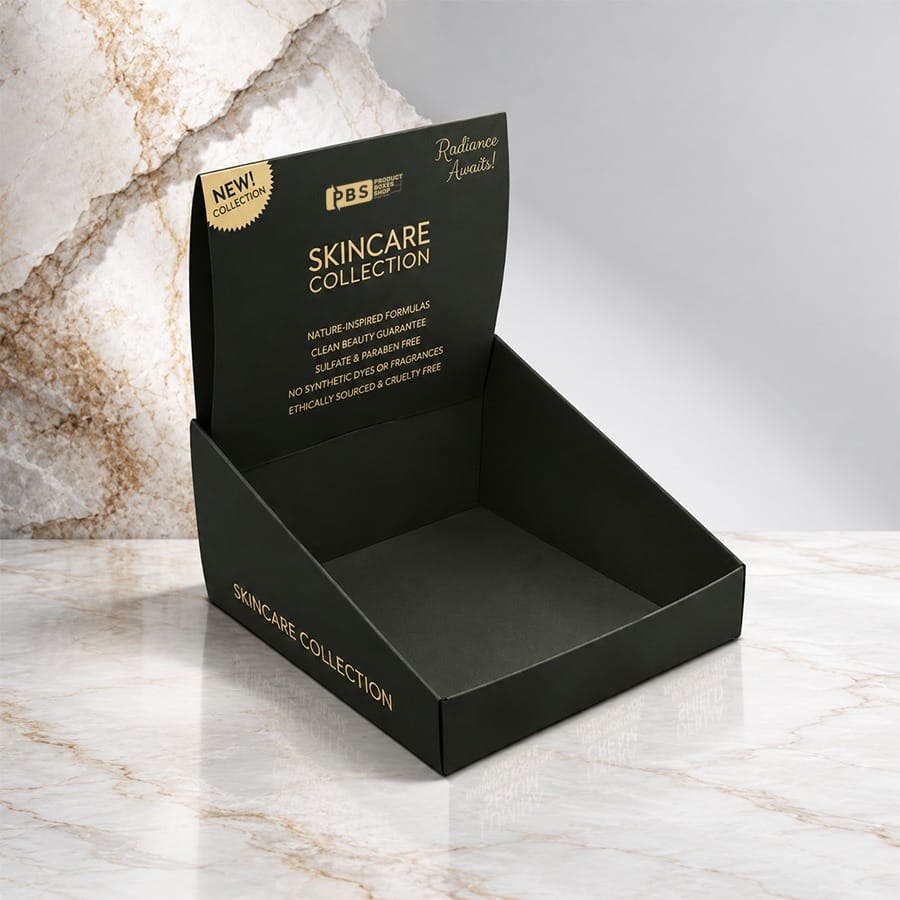
This is your work space on the counter and that’s all it is. To your right there’s a one and a till to your left. And a customer heading your way with an idea of what to purchase. Use text, colour and branding here, to turn your customer’s eye or lose it.What the Counter Display Is Required to Achieve
A good show does three things in a second:
Get noticed from a short distance
Concise words about what your product does.
Easier price, benefit, flavor great seen.
As quickly as the customers see it among other things, it should be easy and clear.
How Much Text Is Enough?
Keep it brief. Don’t make the synopsis too long if no one is going to read it. Keep it to one or two sentences with a brief overview of three or four key points
Text element
Role Guidance
Headline Says what the product is or offers
Short, clear, and readable from a distance Supporting line
Provides one helpful piece of information Product, quality, or functionality, no clear definition
Price or offer Helps with decision making
Take it with you and update it. Fine print
Required Data Only Small, but keep it readable!
If your customer has to stop to read it. Read on the pack a leaflet or by QR code.
Use easy-to-read fonts
No more than a couple of styles and style faces. No more than two fonts. Only bold and clean head liners. Choose a colour of the text that will be easy to read on the box, rather than the computer screen. What would it look like at this size.
Using Color Well
Speed looks good but it can be busy.
Getting Started with Your Brand Palette
Original colours. Use your brand colours so it fits with your product and it is obvious to see. Will you be using the same colours in the next year?
Prepare for contrast
Dark on Light works, Light on Dark even better Your headline, price and logo should be centre stage The brown finish of the kraft-board may detract from the print quality of the lighter colours.
Color choice Effect Important to remember
A primary color New, Identifiable
Add one accent for emphasis High-contrast pair
Easy to understand Keep to two or three main colors
Bright accent Emphasizes an offer
Use sparingly Neutral base
Promote your product Is targeted
This is a selection of the available colours and it might not be an exact match when printed. We do recommend you purchase a print sample prior to your order.
How Much Branding Is Enough?
It should be there, but not so overpowering of the object.
Logo placement
Place it out in front and away from the headline so it isn’t getting in the way of the text. The front panel or top are usually the best place for it. Leave yourself some space with some white space.
Maintain visual on Product
C onsumers buy what they see Use open front or cut out or see through images. Nothing behind an image will sell.
Stay consistent
Match in tone of voice, fonts and imagery to your product and instore. Not linking to your product can harm credibility.
Structure and Material Are Important As Well
Your cardboard counter display box needs to sit securely not just in an upright position, but needs to be set to a size that fits on your countertop area and must be able to hold the weight of your merchandise. Measure up your counter space and then choose a size that won’t block your cash register or leave a mess underneath it. It needs to have a good hard construction to hold your graphics in pristine condition, even a saggy display lowers the quality of the print.
Basic Design Checklist
Question Why you should care
Decipher the message in seconds? Counter Shoppers Have Short Attention Spans
Why is the written material small? The small print gets lost
Is the color contrast okay? Low Contrast Means Less Clarity
Is it possible to see this? One more customer like to know what you’re ordering
Logo readable but not overpowering? Let your branding support rather than compete
Is it suitable to the counter and contain the item? Structure affects appearance
Skip error
Too many Fonts, Colors, or Messages.
Truncating a lengthy paragraph into a small square.
No Dark Colours Use high contrasting colours that are hard to read
Covering the product with heavy artwork
No free sample of research paper for those who need to buy dozens of papers
Conclusion
Good counter display graphics can be simple and bold and not dull. Only a small amount of copy, one or two colours and branding which might contribute to compliment you while also enhancing your graphics. Focus on it as much as you do on the display graphics themselves; and each time. When you make items look as they should they almost all fit together; your display will definitely be better to draw attention and impulse-driven.
FAQs
What are a counter display copy?
Headlines of one or two lines and a word or a short phrase that draw the eye. For longer text, place into your product, leaflet or into a QR code.
How many colours do I use in practice?
You can use two or three main colours for styles most of the time. Then use an additional colour as an accent for one page when you need it. Everything should be high contrast.
Where is the logo?
Original back or top panel in free space. Should be in an appropriate place, but easily seen without flounder the item or headline.
Is the product on display?
Whenever feasible – display with an open front or take a photograph so that shoppers can see the product at a glance.
Would you like to order a sample before placing a larger order?
Sure! It’s always a good idea to order a sample to ensure print colours, readability and format all look correct.